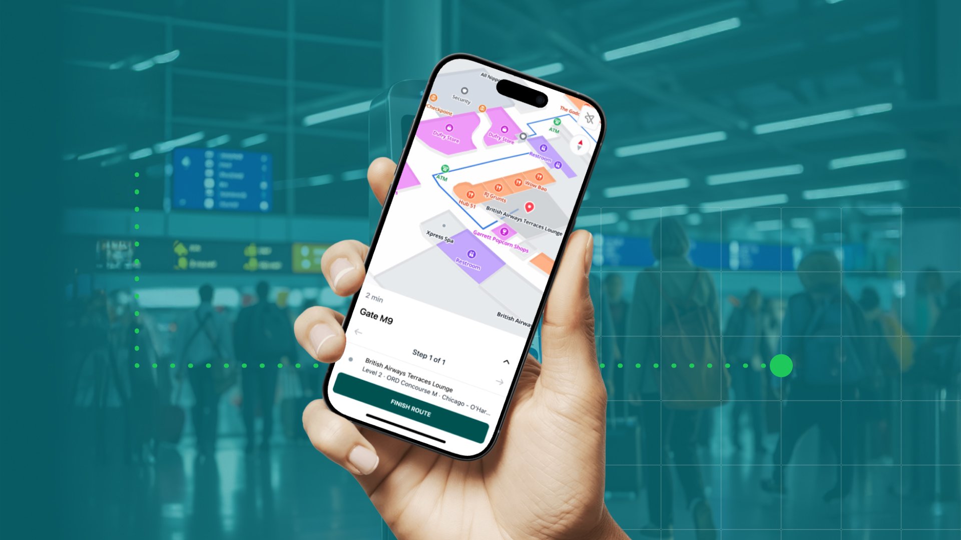
Did you know that MapsPeople goes 120 years back? And were you aware that we had already made a digital map of Europe before Google launched Google Maps? Well, we had, and selling web maps isn’t easy when a big fish like Google launches the world’s most accurate digital map for free. This forced us to rethink our business and today we’re one of the leading indoor navigation providers in the world.
This "behind the scenes blog" is written by Rasmus Steenberg Andersen, MapsPeople CTO and technical architect of the indoor navigation platform MapsIndoors.
The History
MapsPeople can be traced back to J. S. Jensen’s Cartographic Institution founded in 1897. Of course, back then the key business was hand-drawn maps instead of digital indoor navigation. Traditional mapping remained the key product for more than 100 years, when web mapping replaced the paper version.

For 19 years web mapping was our key business. Our focus was on Denmark but we had just started delivering maps services covering the rest of the world, when Google Maps aired in 2005. Just a couple of years before Google Maps was launched, our CEO and Partner, Michael Gram, was asked if he wanted to contribute with funding of a mapping project. The innovators behind the project were the Danish brothers Lars and Jens Eilstrup Rasmussen. Michael didn’t quite believe in the project, so he turned it down, but guess what? In 2004 Google bought Lars’ and Jens’ maps solution and employed the two brothers. The project Michael turned down was released as Google Maps just a year later. Unlike Google, selling digital maps was our part of our key business. Until 2007 we actually offered the same at Google but of course, selling maps is not easy when someone are giving them away for free. This left us with a choice - beat them or join them. Since beating them wasn’t really an option, we joined them and became business partners. For five years we sold Google Licenses, when the demand for indoor navigation started to emerge. This demand planted the first seed in the development of MapsIndoors. Today we’re one of the leading providers of indoor navigation, one out of 30 Google Premier Partners in the world and the only Premier Partner in Scandinavia.
A navigated trip down Memory Lane
The first MapsIndoors solution was designed for University of Copenhagen and released in 2014. Even though it has only been 3 years since then, a lot has happened with MapsIndoors. But what exactly and how does it benefit the users? Take our navigated tour down Memory Lane and see the differences.
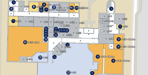
In the first generation solution of MapsIndoors, doorways weren’t defined. This made it look like hallways ended when in reality they were just combined or separated by a door. Obviously, this wasn’t a very satisfying design for a map, but luckily we’ve never heard of students nor staff or guest who has - literally speaking - come up against a brick wall.
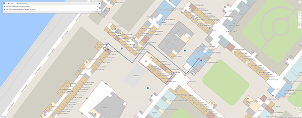
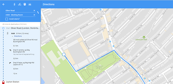
In this early version of MapsIndoors users also had to choose between navigating just within the building or from/to a place outside before selecting origin and destination. It has always been - and still is - possible to avoid stairs in MapsIndoors. Likewise, it has always been possible for users to select their preferred means of transportation: Walking, bicycle, car, or public transport. No matter the means of transportation, directions were given as one complete route, and there were no directions for the Google route outside the venue.
Stronger Google Integration, Better User Experience
Today, the user experience is much better. The Google integration is much stronger in the newest version of MapsIndoors and this really takes indoor navigation to the next level. With the increased Google integration, users no longer have to choose between venue or the outside world; Just start typing the destination into the search field and the MapsIndoors will suggest locations both inside and outside the building.
We’ve also divided directions into smaller steps and hidden directions on other floors. This means that if you’re navigating within the venue and you’re not on the same floor as your destination, MapsIndoors will only show you the directions for the floor that you’re on. Once you change floors, the solution will show you the directions for the certain floor and so on. This makes directions more clear and easier to follow.
If you’re navigating outside the venue and using public transport, MapsIndoors indicates whether you should go by train, bus or metro, which stops to take, and how long the drive is including how many stops. Today, it’s also possible to get the exact directions on the Google route outside the building. This means, that you always get the exact route from point A to point B no matter where you are and how you want to get to your destination.
Of course, the design of the MapsIndoors is always made in collaboration with our customers. For instance, the colours of the City Nav app for City, University of London has been created in collaboration with the university’s neurodiversity team in order to consider colour blind students and staff.
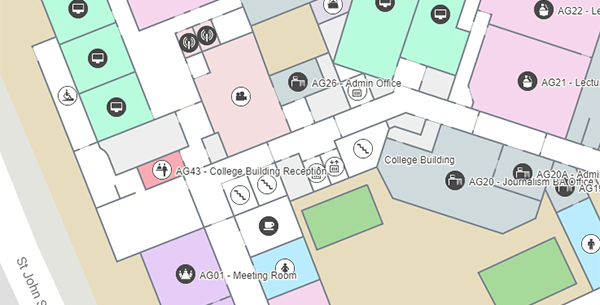
Another design example is the Aalborg University app. The Danish university provided us with a CAD file with all rooms as polygons. This made it possible to create a more realistic map where not only the rooms but also the walls have the right dimensions.
Put Things Into Perspective at Copenhagen Airport
In October this year we put Copenhagen Airport into perspective with our new 3D tiles. The tiles add a whole new depth to the maps that are available on info kiosks at the airport and in the mobile apps. The colours of the map have been created in collaboration with the airport’s digital bureau and matches their design manual.
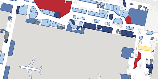
Looking at the very first MapsIndoors solution and the latest 3D map it’s obvious that a lot of improvements have been made over the past three years. Technology is really flourishing and exciting things await in the future.
November 15, 2017


.jpg)
