Navigating indoors is different from outdoors as the sense of direction is easily lost inside, where natural cues might not be available. Users of a facility also need to navigate across floors and might encounter locked doors. Adding to that, a phone's GPS signal is often impaired by a building's construction, making it harder to know exactly where you are.
In this blog post we give you 3 tips to enhancing the user experience of your MapsIndoors solution. If you want more User Interface best practices, download our free quick guide, 'Making a Great Mobile Indoor Wayfinding User Experience'.
Add details to your indoor map for easier orientation
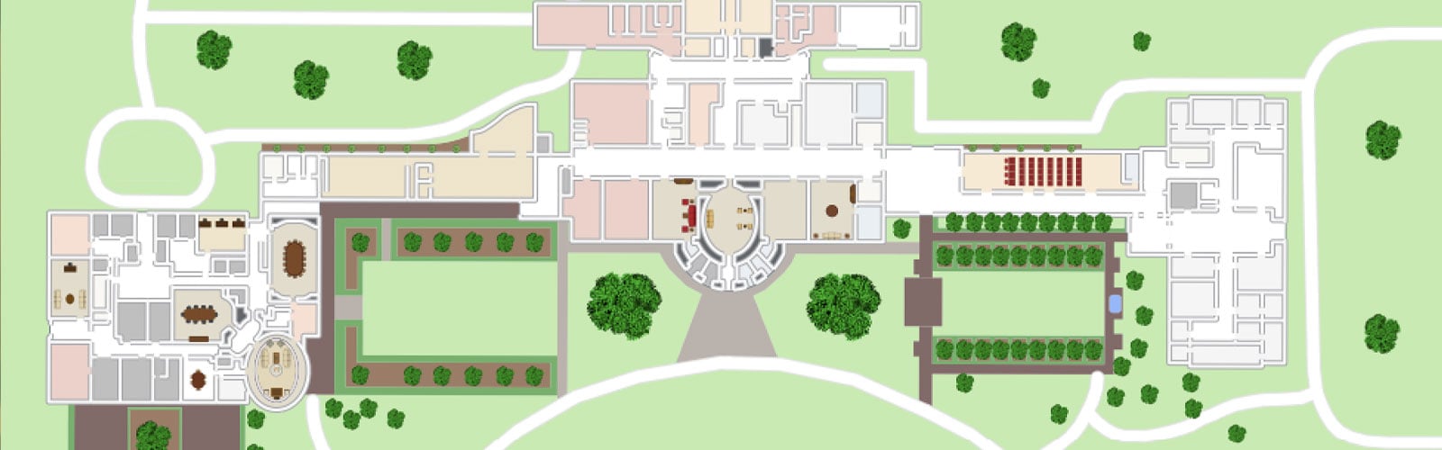
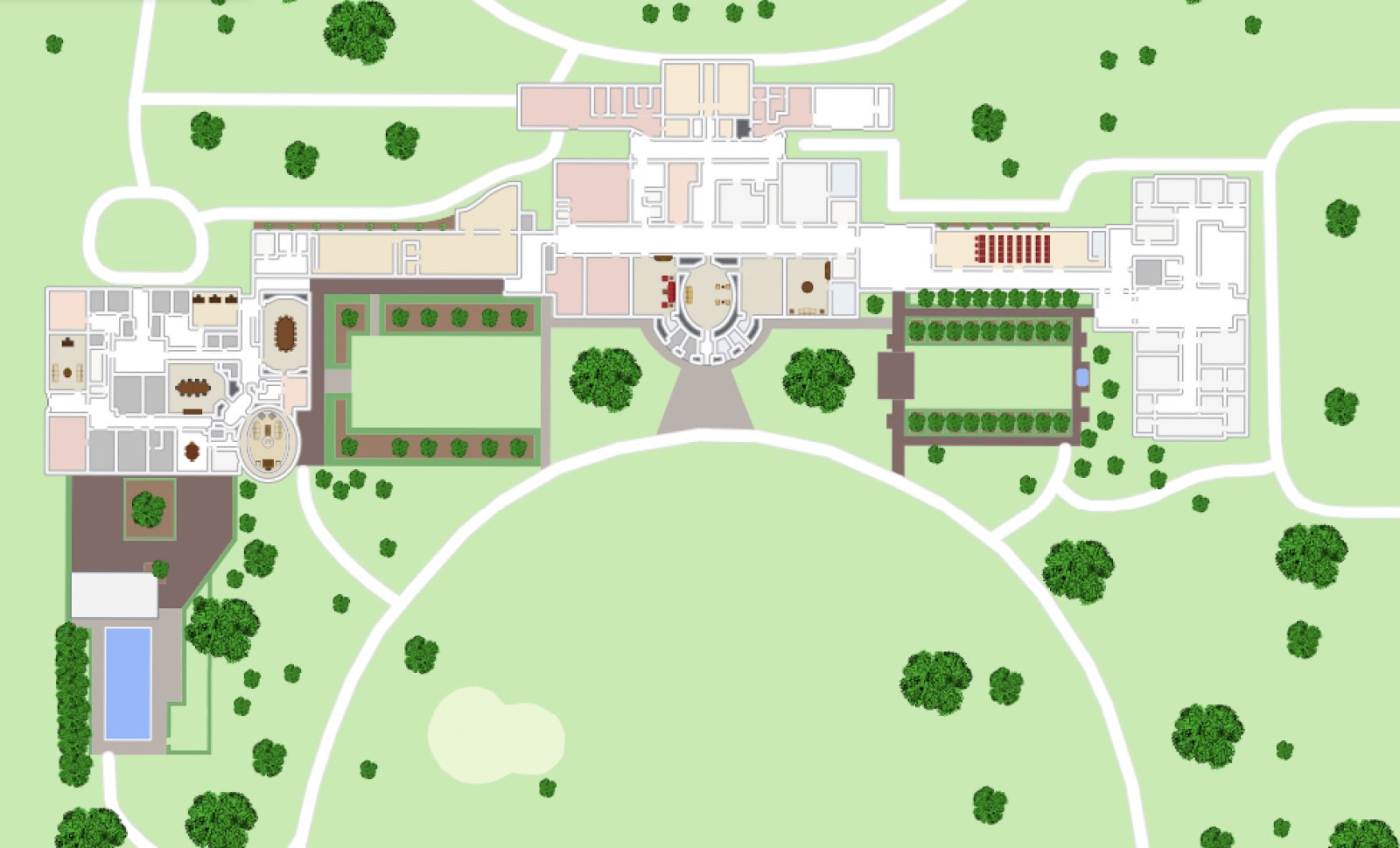
In most cases, a MapsIndoors solution contains tiles detailing one or more buildings situated on top of a map.
The map tiles detailing the actual buildings can be more or less detailed. More detailed maps make it easier for users to orientate themselves in relation to the map. For example, MapsIndoors maps can be customized so that outdoor trees, parking lots, etc. are plotted as well as prominent indoor furniture arrangements.
Our research shows that outdoor landmarks are also important for indoor wayfinding as people will look outside the windows to validate that they are in fact where they think they are; thus a tree, parking lot, sculpture, and the like is useful.
Add Categories to your indoor map for easier wayfinding
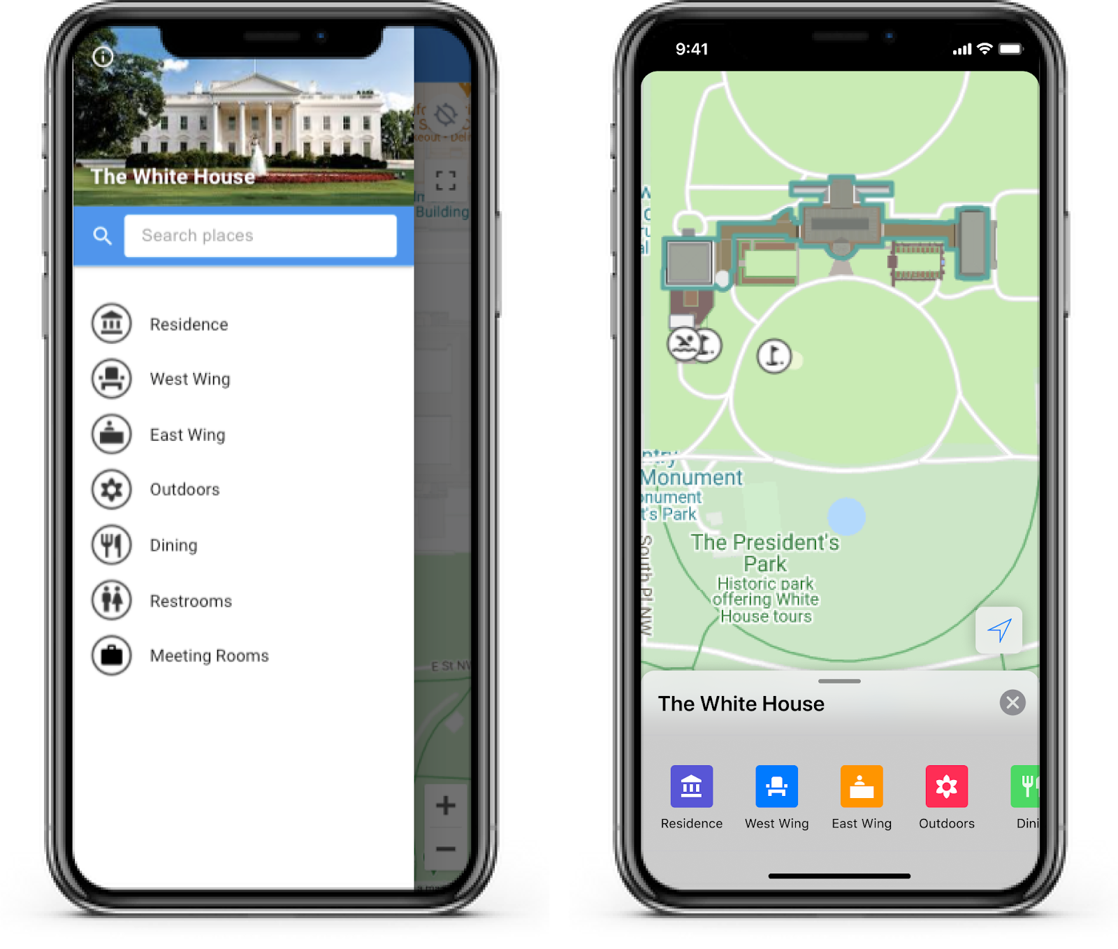
In MapsIndoors all locations have a Type, which is determined per solution. On top of Types it is also possible to make a meta categorization of these types using Categories. For example if a solution has a number of different meeting rooms such as Video Conference Rooms, Small Meeting Rooms, Seminar Rooms, etc., it can be beneficial to create a Category within the CMS called “Meeting Rooms” and associate each of the aforementioned meeting rooms with that Category. This enables you to present a list of categories for the users to navigate in instead of presenting all meeting rooms together with canteens, restrooms, etc.
Add easily understandable Directions to your indoor map
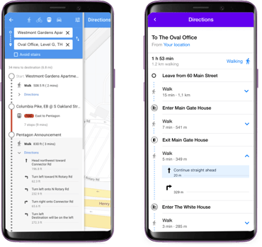
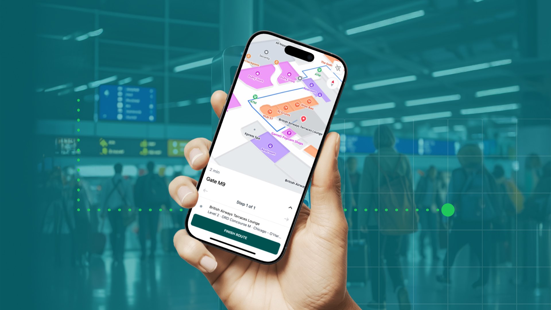
Directions that are the result of a user’s route query can be displayed in multiple ways. In the MapsIndoors Standard apps the main “steps” are displayed with the option to expand substeps (details).
Whether all navigation steps are displayed up front or not, is up to the individual app. However, the MapsIndoors SDKs deliver the information in steps and substeps. From a UX perspective it is in most cases best practice to provide an easily understandable overview, so the user doesn’t have to scroll through a long list of substeps. It is also best practice to add a summary of the expected travel times, which is also available from the MapsIndoors SDKs.
In the MapsIndoors Standard apps it is possible to get a route and directions from a Google place. Therefore the users can also select “Transit” as a travel mode, which is basically public transportation. From the Google Maps API it is possible to obtain the logo, color, and heading of, for instance, a bus, which can be used to provide additional information for a route.
With regards to travel modes, consider only showing the ones relevant to a solution. If a solution is solely indoors, then biking, driving, and transit travel modes are most likely not relevant.
If you want to know more about how you can enhance the user experience of your indoor mapping solution, download our free quick guide, where we show you how to use Locations, search, and routing features along with more best practices.

November 9, 2020
.jpg)