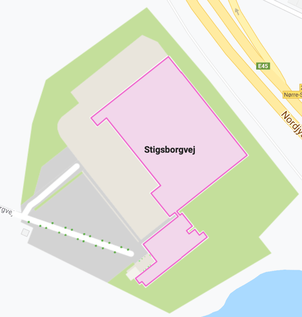
We are introducing a new selection highlight color across the MapsIndoors products, and it is quite different from our previous teal color so we wanted to write a bit about the background for our choice.
To cut to the chase, our new selection highlight color is pink:

The reasons for choosing such a dramatic color are both simple and complex.
First of all, we think it is simply a great-looking color, and it is from the area of the color spectrum where we can be sure we have the highest degree of contrast with both the surrounding map, and the MapsIndoors-provided tiles. Grass is green, water is blue, and what you, as a user, need to focus on is very easy to find.
We firmly believe in making products that meet the needs of all people. Complying with accessibility requirements like WCAG (Web Content Accessibility Guidelines) makes sure we have people with disabilities in mind, but in reality, the experience is improved for all users. High contrast, appropriate text sizes, and an overall simplicity of use do not come at the expense of elegance and sophistication, but go hand in hand in beautiful products.
We are aware of the implications changing the color has on the myriad of solutions deployed around the world, so we are making this change in the MapsIndoors CMS first, and then rolling out across our Android, iOS and JavaScript SDKs. The SDKs will have an option to override the default color and set a different color as the selection highlight, to ensure you have full control over what is in your application.
Our Standard apps will use this new color shortly after it is available through the platform SDKs.
If you want to read more product news, make sure to click on the button below to visit our product blog.


