In this episode of Spatial Experience Design, MapsPeople Solutions Engineer Brynley Herbert joins host Søren Vasø to explore what today’s airport maps should be doing—and why most of them fall short. From live wait times at security to adaptive wayfinding for janitors, travelers, and accessibility needs, this conversation unpacks how responsive maps are improving the airport experience. We’re talking 3D storefronts, rideshare overlays, and staff-specific routing—all powered by shared infrastructure and smart data. Whether you’re running an airport, designing tech for travelers, or just wondering why an airport terminal always feels like a maze, this episode will reframe the digital map as a strategic asset.
Key Topics:
-
- Strategies for intuitive navigation in airport experiences
- Accessibility mapping and the European Accessibility Act
- Role-based map views for staff and travelers
- Map monetization through branded 3D assets and promos
You’ve seen airport maps that are static, outdated, and only slightly more helpful than asking a stranger with a suitcase. Operations are inefficient, travelers are left guessing, and businesses miss out. But the tools to fix these problems are already here. Let’s break down what an airport map should do—and how smarter design, real-time data, and dynamic visuals can completely transform how we experience travel.
The Perfect Moment: Rising Expectations Meet Easier Delivery.
Travelers expect instant answers. If their gate changes, they want to know now. If the coffee line is short and they have time before boarding, they want a map that can tell them exactly where to go—fast. Thanks to AI and better delivery systems, what used to be costly or complicated is now scalable and surprisingly budget-friendly. The pressure to meet expectations is high, but the payoff is big.
Real-World Context Makes All the Difference
An airport map should feel connected to the terminal building and integrated with the city it's in. When you can zoom out and see how the airport connects to ground transport and surrounding neighborhoods, or zoom in and immediately identify which terminal you're looking at, travelers get the context they need. That means fewer lost people, fewer missed flights, and happier passengers overall.
Layered Information = Smarter Navigation
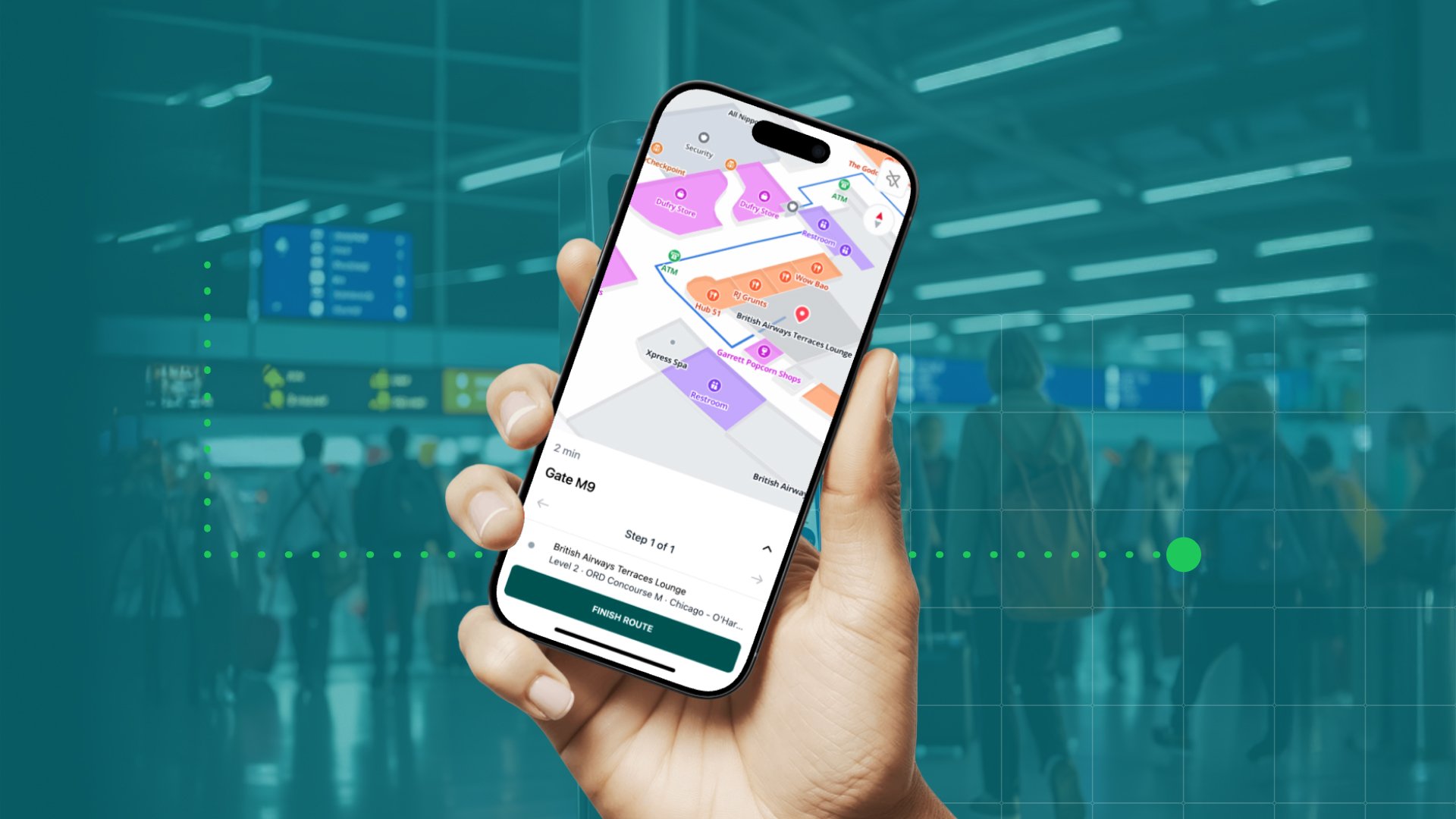
Zooming into an airport map shows the details you need, adapted to your view. Need to know what terminal you're in? It’s labeled clearly. Want to find the nearest food court or lounge? Color-coded areas and icons help users interpret the environment at a glance. For travelers in a hurry, visual clarity is everything. More confident, self-sufficient visitors mean less strain on airport staff.
Security Wait Times Shouldn’t Be a Surprise
What if your map could factor in security checkpoint delays into your walking time?
It can.
By marking security zones as key areas and feeding in real-time sensor data, modern maps can show estimated wait times and route travelers accordingly. That’s mission-critical for environments like airports, where people often feel time pressure.
Wayfinding That Thinks Holistically
Basic directions don’t cut it anymore. Users expect accessible routes that avoid escalators or stairs, walking time estimates, and turn-by-turn instructions. By combining outdoor routing with indoor routing, you can create a seamless path, from the parking garage all the way to the jetbridge. Travelers don’t care if it’s indoor, outdoor, or somewhere in between; it’s all a part of their travel journey.
Accessibility is Required
With new regulations like the European Accessibility Act taking effect, inclusive navigation is no longer a nice-to-have, it’s the law. That means maps must support users with visual impairments, mobility challenges, or cognitive disabilities. Think AR directions, sensor-triggered guidance, and step-free route options.
Dynamic Maps Open Doors for Everyone
Good maps help travelers. Great maps can also support janitorial crews with optimized cleaning routes based on restroom usage, enable maintenance teams to respond faster, and provide staff with access-controlled shortcuts. Using role-based permissions, different user groups can access different views—without duplicating map data. It’s the same infrastructure, just personalized for a specific purpose.
From Map to Marketplace
Your airport map can actually become income-generating digital real estate. Starbucks wants to stand out? Sell them a 3D model on your map. Burger King running a meal deal? Drop the offer right onto the floor plan. These visual highlights drive foot traffic and offer a new revenue stream for airports—without cluttering the user experience.
One Map. Dozens of Use Cases. Endless Potential.
Start thinking of the map as shared infrastructure—a flexible digital foundation that any workflow or app can plug into. Whether it's a ride-share zone clearly marked for rideshare pickups, or real-time airplane departures shown in 3D, the possibilities grow with every data layer you add. The map becomes a dynamic asset that serves staff, vendors, and travelers alike.
Ready for Takeoff?
A better airport map means more business, improved accessibility, and smarter operations.
It’s time to stop settling for static PDFs and vague terminal diagrams. Today’s airports need maps that deliver the right information, in context. Airports should inform, adapt, and even delight travelers.
And if your map can’t do all of that? Well, maybe it’s time for a new one.
Additional Resources:
June 27, 2025
.jpg)