
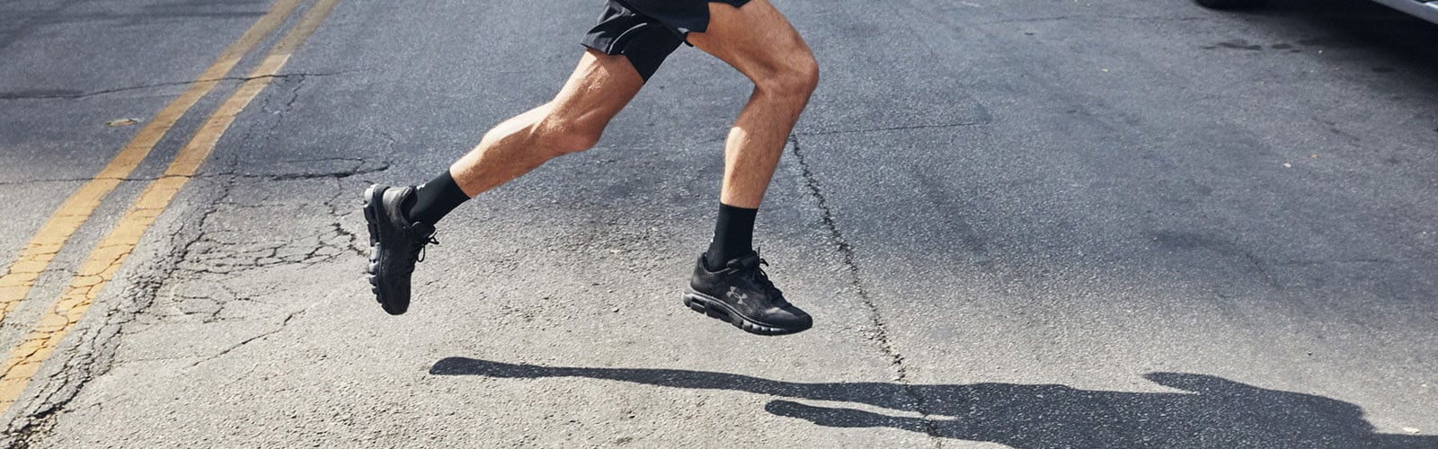
Whether you are a gym rat or have a hard time hyping yourself up to put on your sports shoes, you should know about Under Armour and how its integration of Google Maps can help you on your fitness journey.
There are many activities that can be done outside of the gym, be it running, active walking, cycling, or climbing. But the downside of going independent on your workout is that it can be difficult to track your progress or even know how much work you’ve put in a single session. That’s where Under Armour comes in.
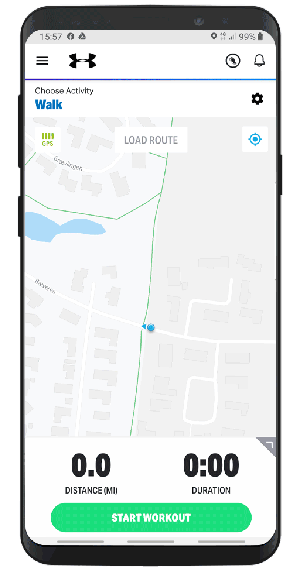
Type in Under Armour in your application library of choice and you will be shown an impressive number of results tailored for specific activities. You can download the app tailored for your preferred sport, or MapMyFitness which is an all-inclusive app. The main difference between ‘MapMyFitness’ and sports-specific ‘MapMy…’ apps is that in the latter the content is catered to an individual audience and will therefore, provide default activities. A good thing is you only need a single login across all apps. You can download multiple ‘MapMy…’ apps and see what works best for you without having to create different usernames and passwords.
But what exactly is the point of these apps in the first place, and how does it relate to Google Maps? Well, it's simple, one of the main features of MapMyFitness is to track and map your workouts using GPS technology. That means that you can go for your usual run and then gain insight on the distance, duration, elevation, and pace. You can also save your usual run route and find new ones in your area through community sharing to spice things up.
Other advantages of MapMyFitness are the tracking of calorie burn and of your progress over time. Having the app for the last 7 years, one user can see that he logged 784 workouts, rode 8,891 miles on his bike, and burned 483,000 calories. Being able to see your progress over a period of time and setting goals accordingly is a big reason why MapMyFitness is such a success. And by that, I mean not just seeing numbers and statistics, but visualising on a map your progress and patterns over time.
MapMyFitness is great for its integration to the technology of today and of tomorrow. You can easily sync data coming from other apps to track your nutrition, or wearables like Fit1zbit or Garmin. But Under Armour goes a step further with their digitally connected athletic shoes - a pair of trainers with an incredibly accurate GPS and sensors that record all the metrics you need for tailored instructions on how to improve. Here are a few of the shoe’s useful features:
- Records the distance run, duration, pace, stride length, calories and cadence all in real-time.
- See your average speed, your best times, and personal stats.
- Help reduce injury with an in detail look at your stride length
- Get in-app coaching tailored to you through the data collected
- Load pre-planned running routes near you
What’s great about that is that all the data collected automatically uploads to the app, so you get feedback on your performance as soon as you are done. And that is where Google Maps really shines.
Multiple studies done about the use of fitness trackers have found that offering the user’s data in a visual manner makes it more accessible to the user and easier to understand. It makes sense when you know that the human brain processes images 60,000 times faster than text. That is why the use of Google Maps by the ‘Map my…’ apps is so brilliant. It creates a visual platform that communicates the data collected by Under Armour’s sensors in a way that makes sense, is easy to process, and gives a contextual insight into your activity. It is one thing to see a list of numbers that reflect your stride and pace, but it’s altogether better to see exactly where on your route your performance changes, and what way.
Google Maps allows your data to make sense in your environment. That means that it highlights things you may never have seen before, like the details of how your performance changes between a dirt road and a concrete one, or a straight line and a curve. Graphs and statistics are great, but maps help to make better sense of the information, and give practical and personalized coaching advice.
Health is not only defined by physical wellbeing but also includes mental and social welfare. It is a tall order for an app to fulfil, but Under Armours’ MapMyFitness definitely rises up to the challenge. The integration of Google Maps contributes to this by increasing your motivation through visual cues, connecting your activity to the physical environment and including you in a community of MapMy members.
If you want to discover more inspiring use cases, read how How Geoguessr has created a discovery game with Google Maps and Street View, or how Wolt uses Google Maps to deliver food in 55 cities across 17 countries.


November 8, 2019

.png)